Should I Stay Or Should I Go?

Category: Assignment 2 – Final Review – Module 3-5 Blog Posts and Comments

Module 5: Storytelling and Creating Video

Twine Story Telling

This is an interactive story about launching a rocket into space, where every decision you make shapes the outcome of the mission. From handling technical challenges to navigating unexpected situations, your choices will determine whether the mission ends in success or failure. Dive in and see if you have what it takes to guide the rocket to its goal!

Here is the link to the game: Rocket Launch Adventure
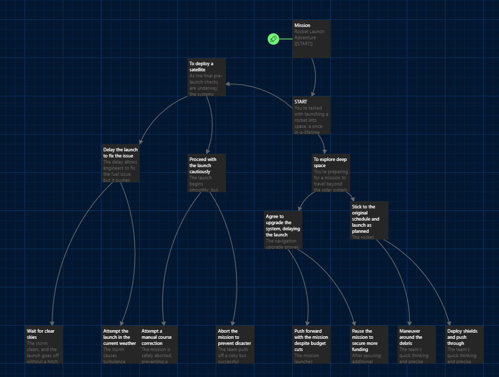
A story with multiple branches, like the one made for rocket launch, gives a lively learning environment to students. It promotes them to make active choices, think critically and comprehend cause-and-effect relationships. Within the scenario of rocket launching narrative, learners study how decisions such as postponing a launch or moving forward despite dangers can result in different effects. They can evaluate consequences of their actions through this process which helps enhance problem-solving abilities and flexible thinking skills. When learners are given agency, branched narratives captivate them both emotionally and intellectually. This makes the learning process more engaging and something they will remember.

Video for Learning

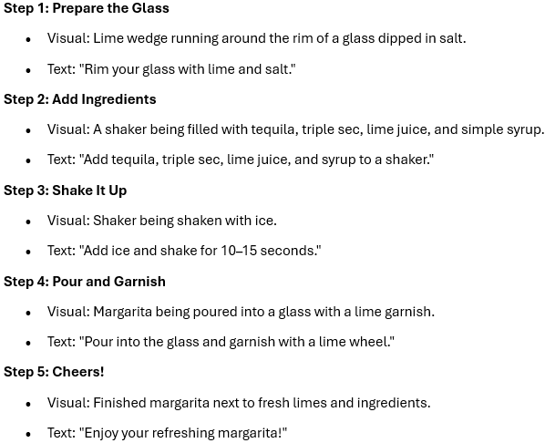
In the video, I plan to show a simple, step-by-step guide on how to make a classic margarita from scratch. The goal is to make the process easy to follow for anyone, whether you’re a beginner or a cocktail enthusiast. By breaking it down into clear steps with visual demonstrations, I want viewers to feel confident recreating this refreshing drink at home. The video will be both instructional and fun, highlighting how a few simple ingredients can come together to create the perfect margarita.

Storyboard & Script
Short Video

Capturing video away from the screencast was an exciting but slightly more complex experience. It required me to think about not just the content but also the visuals, framing, lighting, and overall flow of the video. One of the main challenges I faced was ensuring that the setup looked clean and professional while working with the tools and space I had. Adjusting the camera angles to get the perfect shots for each step of the margarita-making process took more time than expected, and it was tricky to avoid shadows or uneven lighting.

On the other hand, what I found easier was working hands-on with the ingredients and demonstrating the steps. It felt more natural and engaging compared to narrating over a screencast. The tactile process of actually doing something in front of the camera helped me connect more with the content.

Next time, I would plan the setup more thoroughly, perhaps experimenting with better lighting beforehand and testing camera positions to save time during the shoot. I would also consider scripting and rehearsing transitions between steps to ensure a smoother and more polished final video.

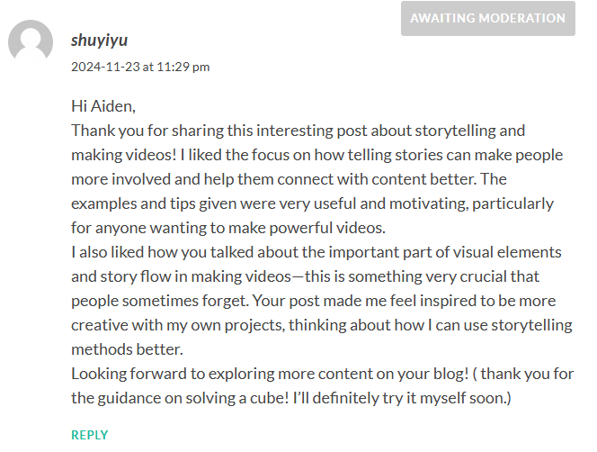
Comment to Other’s Post (Aiden Lattanzi)
Module 4: Design Principles for Effective and Accessible Multimedia

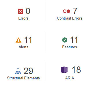
WAVE Accessibility check

After running the WAVE Accessibility check on my blog, I found that it overall met accessibility standards well. The structure is organized with headings, making navigation smooth for screen readers. The color contrast was right, providing good readability for users with visual impairments. However, there are still some areas could see some improvement. For example, adding detailed descriptions to images would ensure users who rely on screen readers get the full context. These improvements would help make the content better for everyone to read.

Canva Infographic about Smoking:

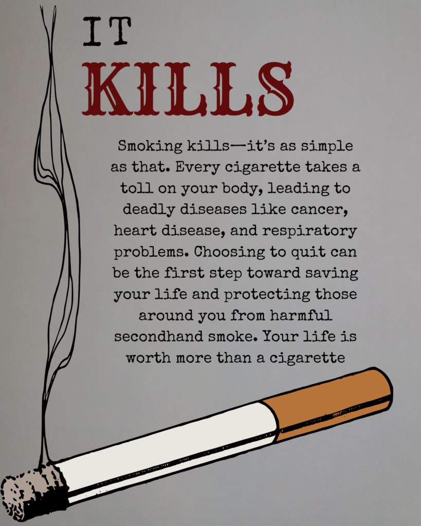
My Canva infographic about smoking is harmful

Design Principles :

Contrast:

The use of contrasting colors (black and red on a light background) makes the text stand out and draws attention. The word “KILLS” in red emphasizes the most critical part of the message, making it looks alarming.

Hierarchy:

The poster uses a clear hierarchy to guide the viewer’s eye. The large, bold “IT KILLS” text and the big cigarette serves as the primary focal points, immediately delivering the key message. The body text is smaller, providing additional information.

Alignment:

The text is well-aligned, creating a neat and organized look by aligning all text in the middle of the poster.

Imagery:

The cigarette adds context to the topic without being overly graphic. The smoke trails naturally lead the eye toward the text, creating a visual flow that reinforces the theme.

Simplicity:

The poster keeps the design simple and uncluttered, ensuring that the main message isn’t lost. This approach helps the viewer quickly understand the purpose without being overwhelmed by too much content.

Color Choice:

Red is used strategically to bring a sense of danger and urgency, while black provides a neutral base that reinforces the message and the seriousness.

Reflection:

To me, inclusive design means creating products, content, and environments that are accessible and usable for people of all levels of capabilities. It’s about understanding the diversity of users and designing in a way that considers different perspectives from the start point, rather than treating accessibility as an afterthought or an optional feature.

To make my infographic more accessible, adding a color blind filter is a potentially effective modification. This feature will allow users with color vision deficiencies to adjust colors in of the content to shades they can distinguish.

Module 3: Principles of Learning Design and Active learning – Drivetrain of Vehicles

Main Idea: Understanding Vehicle Drive Types

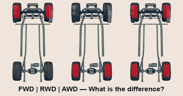
When shopping for a car, the vehicle’s drive type can make a big difference in handling, fuel efficiency, and stability in various conditions. Let’s dive into three main types: Rear-Wheel Drive (RWD), Front-Wheel Drive (FWD), and All-Wheel Drive (AWD).

Rear-Wheel Drive (RWD):

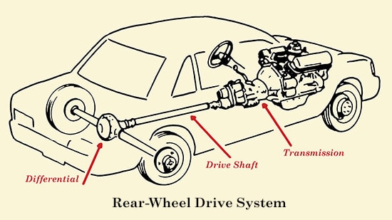
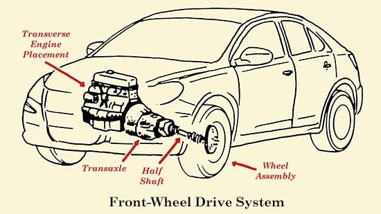
How a Car's Drivetrain Works | The Art of Manliness

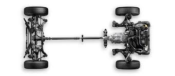
In RWD vehicles, power is directed to the rear wheels. This setup allows better balance and handling, especially in sporty or high-performance vehicles. RWD is also common in trucks because it distributes weight better when towing or carrying heavy loads. However, RWD can be less stable in wet or icy conditions due to its rear-wheel focus, which may cause fishtailing on slippery surfaces.

Front-Wheel Drive (FWD):

FWD vehicles direct power to the front wheels. This setup improves fuel efficiency, making it popular in compact cars and many family vehicles. FWD provides better traction in mild, everyday conditions, particularly on slippery surfaces, since the engine’s weight over the front wheels helps grip the road. While it’s highly practical, FWD is less ideal for high-speed performance, as it tends to have less sharp handling than RWD or AWD setups.

All-Wheel Drive (AWD):

AWD sends power to all four wheels, either full-time or when needed. This improves traction on rough or uneven surfaces, making AWD ideal for driving in unpredictable weather or off-road conditions. AWD is common in SUVs and some crossovers, as it provides confidence in diverse conditions. However, AWD vehicles are generally less fuel-efficient and can cost more due to the additional complexity of the drivetrain.

And here is a youtube vedio which explains everything in detail:

Now Let’s play a little game to test if you know which car to get!

The Overview Plan from This Lesson:

Big Idea: Help learners understand the differences between Rear-Wheel Drive (RWD), Front-Wheel Drive (FWD), and All-Wheel Drive (AWD).

Learning Outcomes: Identify the pros and cons of each drive type and know where they’re most useful.

Evidence of Learning: Successfully match drive types to their benefits in the drag-and-drop game.

Assessment: Performance in the drag-and-drop game to confirm understanding.

Learning Activities: Read the descriptions of each drive type and practice with the drag-and-drop matching game.

Reflection

I enjoyed creating this interactive lesson! Using H5P to make the drag-and-drop game was engaging and intuitive, making it easy to remember each drive type’s unique benefits. I like how H5P allows different learning styles. Scaffolding was a key part of my design. The descriptions provided foundational knowledge before learners moved to the game for practical application.

© 2024 SY BLOG

Theme by Anders NorenUp ↑