Learning Design Blueprint
1. Overview of Topic
This is a course designed for beginners in the Java language, aiming to teach you the knowledge requirement for printing a pyramid in Java. Through two lessons, you will be introduced to the Java online compiler, variables, loops, and the creation of simple patterns, culminating in the ability to print a pyramid shape with Java code.
Lesson Plan
Big Idea
Java is a powerful programming language with applications in many fields. By learning the basics of Java, including printing text, using variables, and constructing loops, beginners can build a strong foundation for future programming journeys. This course allows learners to apply their knowledge to create visual patterns, improving creativity coding.
Learning Outcomes
As we briefly mentioned in the Big Idea, the learning outcomes of this program are for learners to gain basic theoretical and practical knowledge of Java programming.
At the end of the program, learners can:
- Use the W3schools Java online compiler to write and run Java code.
- Understand and apply Java print statements and variables (integer, string, char).
- Understand and implement for and while loops for pattern generation.
- Write a program to construct a pyramid shape using loops and variables.
Evidence of Learning
Evidence of learners’ learning will be demonstrated in the following ways:
- A recap quiz at the beginning of Lecture 2 on the content of Lecture 1.
- Interactive quizzes embedded in lecture video to test understanding of loops and pattern creation.
- Programming exercises where learners replicate and modify example code.
- A final pyramid program written by learners, demonstrating their ability to combine concepts from the course.
Assessments
This course assesses student learning outcomes in several ways.
- Quizzes at the end of each lesson (usually multiple choice and judgement questions)
- Commentary on each lecture’s post and narrative of what they have learnt or feedback on problems they have encountered.
- Evaluation of the final exam completed by learners individually.
- Create a program that calculates and prints the area of a rectangle.
- Making a pyramid in Java using For/While Loop.
Learning Activities
We have the following activities to progress the lesson and enable students to achieve our desired outcomes:
- Each lecture is published as a post on the WordPress blog, which contains the lectures recorded by our team members, providing clear explanations for learners.
- H5P is used to make the videos interactive during the course, with a pre-lecture Recap quiz and a What Did You Learn Quiz at the end of the lecture.
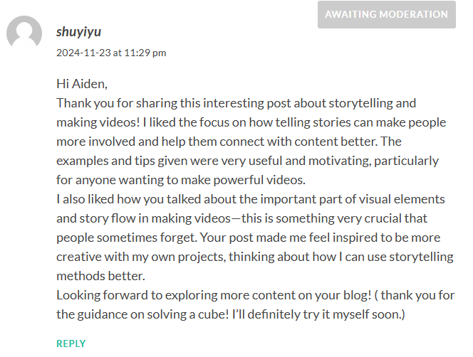
- Involve learners in discussions, with each learner commenting and providing feedback after watching posts and completing learning resources.
- Encourage students to follow the steps of the course with hands-on code examples.
- The final lecture initially guides the learner through the construction of the pyramid program, after which the student will independently complete his or her own final pyramid code.
3. Lesson Plan
| Lesson Description: | Total Time: 14 minutes |
| This lecture covers the use of W3schools’ Java online compiler. Learners are then introduced to basic print methods (System.out.println()), the syntax for printing text, and the use of variables, including integer, string, and char types. | 7 minutes |
| This lecture introduces while/for loops in java, demonstrating iterative printing. Learners will combine loops and variables to print increasingly complex shapes, starting with simple triangles and eventually pyramids. | 7 minutes |
Reflection
Discussion of how each member has contributed to the project
| Shuyi | Bifei | Shiyu | Tommy |
| blog writing | course planning | course planning | video creating |
| h5p media making | slide making | outline making | script planning |
| final exam making | script planning | script planning | subtitle making |
| blog formatting and posting | writing part of the reflection | writing part of the reflection | H5P question Making |
| writing part of the reflection | writing parts of the reflection |
Media and Tools Used
Media
- Video
- WordPress blog post
Tool
- Youtube (to create video and subtitle)
- Zoom (to record videos)
- Google Docs (for project planning and script making)
- WordPress (to create course web page and blog post)
- Java Online Compiler(java compiler)
Principles, Theories and Techniques Used
The TPACK Framework
CK – This course will focus on explaining several of the fundamentals of Java, and the instructor demonstrates mastery of subject matter knowledge by showing code samples and running them.
PK – This course first teaches students to print knowledge and then for/while loop, step-by-step, gives students the ability to realize the print pyramid on their own. The course quizzes and comment/discussion activities also allow students to be more active learners.
Cognitive Load Theory
- Eliminate extraneous images by only putting images of code examples. (Coherence principle)
- Record video in a quiet environment to eliminate extraneous sounds. (Coherence principle)
- Use the mouse to point out the part where I am trying to talk about in the video to draw the audience’s attention (Signaling principle).
- Use an image with the important part of the code to show how it is done.(Signaling principle).
- Displaying both the code on the slides and the online Java compiler aligns with the Redundancy Principle. We first teach the students the concept of coding by showing them pictures on the slides, then use the compiler to show them again how it actually works. The slides show the main points, like key syntax or structure, while the compiler lets us see the code running in real-time. This avoids repeating the same information and helps learners focus and understand better without feeling overwhelmed.
- Course recorder use conversational language and place himself in the upper right corner using a camera(personalization principle)
- Spoken in the first or second person(personalization principle)
- Use human voice (voice principle)
Active Learning
Coding is language, in order to learn a language, we have practice speaking and writing it. This is why I invite the audience to code along while watching the video for deeper learning. Active learning can also help students develop critical thinking skills which is an important concept in learning.
Backward Design
We began with the ultimate goal of teaching learners to print pyramids independently, and the activities in the following lessons are designed to achieve our ultimate goal. We also use a constructive alignment approach to course design, where all of the learning output,assessments,activities, of the plan are in service of the ultimate desire.
Universal Design for Learning(UDI)
We used contrasting colours, mainly black and white in our slide design to maximize readability for all audiences, including those who are colour-blind, as these are the easiest colours for people to distinguish and also align with our coding teaching theme.
By focusing on one concept at a time, we make it easier for learners to absorb and process information without being overwhelmed by too much content at once. This step-by-step approach helps learners build understanding gradually. This reflects the Cognitive Load Theory.
Accessibility:
We have taken into account the fact that some students may be hard of hearing or unable to turn on the sound, and we have added subtitles to the videos, an inclusive design that can also benefit non-native English speakers.
Script (What Tommy Has to Say In the Video)
Lecture 1 (Print statement and Variables)
- Introduce Java
- Introduce Java Online Compiler (open the link on this slide, click “try it yourself” and start coding with me) active learning
- Java prints statements and variables(explain the right page is for programming and the left page prints out a message on how many ways to print integers and make integers into variables)
- you don’t have to worry about public class main and public static void main for this lesson, if you’re really into Java, you will learn more about it as you discover the language.
- print statement
- integer
- string
- char
- printing variables
Lecture 2 (For/While loop)
- Introduce while loops
- Increment and decrement
- for loop
- 3statment about for loop
- inner loop
References
“Quiz questions for Java on the topic of for/while loop, print and variables” prompt. ChatGPT, 29 Nov. version, OpenAI, 3 Dec. 2024, chat.openai.com/chat.
ChatGPT is used to assist the process of making the final exam for this java tutorial. This can bring a wider variety of questions to the exam. A few modification was made on the generated result since some of the questions are not included in the tutorial video. Also, some of the questions are unnecessarily complicate for beginners.






Recent Comments