WAVE Accessibility check

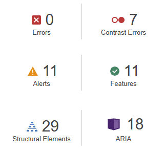
After running the WAVE Accessibility check on my blog, I found that it overall met accessibility standards well. The structure is organized with headings, making navigation smooth for screen readers. The color contrast was right, providing good readability for users with visual impairments. However, there are still some areas could see some improvement. For example, adding detailed descriptions to images would ensure users who rely on screen readers get the full context. These improvements would help make the content better for everyone to read.
Canva Infographic about Smoking:

Design Principles :
Contrast:
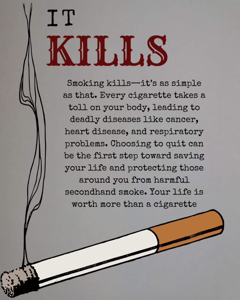
The use of contrasting colors (black and red on a light background) makes the text stand out and draws attention. The word “KILLS” in red emphasizes the most critical part of the message, making it looks alarming.
Hierarchy:
The poster uses a clear hierarchy to guide the viewer’s eye. The large, bold “IT KILLS” text and the big cigarette serves as the primary focal points, immediately delivering the key message. The body text is smaller, providing additional information.
Alignment:
The text is well-aligned, creating a neat and organized look by aligning all text in the middle of the poster.
Imagery:
The cigarette adds context to the topic without being overly graphic. The smoke trails naturally lead the eye toward the text, creating a visual flow that reinforces the theme.
Simplicity:
The poster keeps the design simple and uncluttered, ensuring that the main message isn’t lost. This approach helps the viewer quickly understand the purpose without being overwhelmed by too much content.
Color Choice:
Red is used strategically to bring a sense of danger and urgency, while black provides a neutral base that reinforces the message and the seriousness.
Reflection:
To me, inclusive design means creating products, content, and environments that are accessible and usable for people of all levels of capabilities. It’s about understanding the diversity of users and designing in a way that considers different perspectives from the start point, rather than treating accessibility as an afterthought or an optional feature.
To make my infographic more accessible, adding a color blind filter is a potentially effective modification. This feature will allow users with color vision deficiencies to adjust colors in of the content to shades they can distinguish.
Recent Comments